FGU Nordsjælland
A new voice for every corner of FGU
Preparatory education for young people who need a new path toward work or further studies.


The challenge
Give FGU Nordsjælland a visual identity that works across schools, audiences, and platforms — and actually gets used.
Making FGU’s value visible
FGU Nordsjælland consists of multiple schools working with different audiences; from students and parents to caseworkers and businesses. But their visual communication lacked consistency, structure, and professionalism.
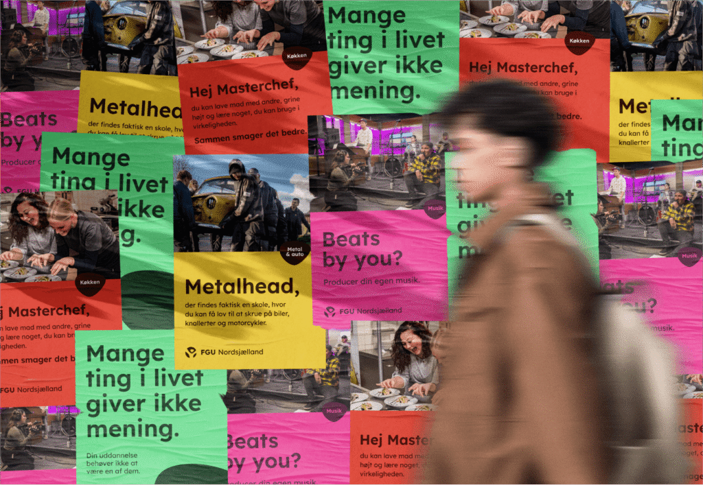
Posters, presentations, and social content were often unclear and visually fragmented. To support their mission and make the value of FGU’s education visible to all, we created a new, cohesive identity — built to be both flexible and unifying.
Visual identity
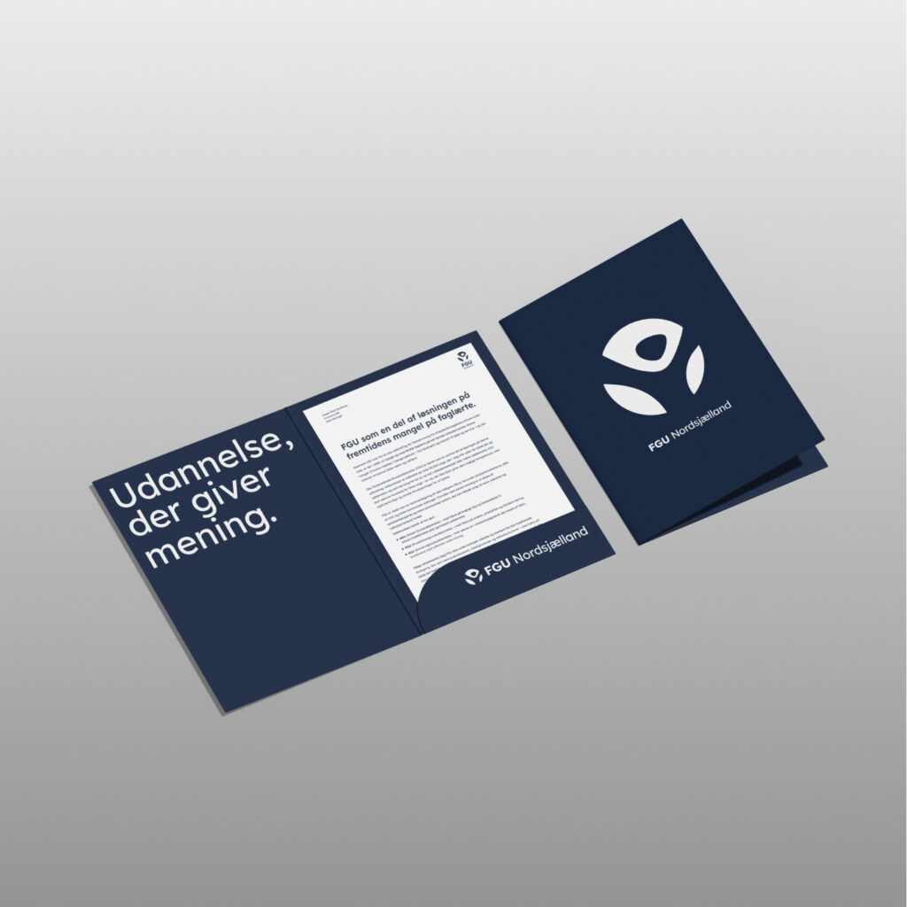
We developed a complete visual rebrand ; from typography, colour systems and layout principles to a tone of voice that matches the organisation’s values.
The design system had to be flexible enough to speak to a 15-year-old in one post, and a municipal caseworker in the next, all while still feeling like FGU.
The final identity is warm, human, structured and recognisable, with carefully defined palettes for each audience segment and a focus on clarity and emotional resonance.

Templates & tools
To make the new identity stick, we created a full set of templates covering everything from posters and PowerPoint decks to website elements, social media assets, student communication and internal documents.
The system is built to empower, rather than restrict, and ensures that staff across all schools can create materials that look sharp, feel unified, and speak with confidence.

Turning values into communication
FGU Nordsjælland isn’t just speaking to students. Their communication has to earn trust from parents, speak the language of businesses, and show value to public institutions.
Through colour psychology, tone of voice work, and message clarity, the new identity helps frame the organisation as what it is: a vital part of the education ecosystem — and a place where young people can grow with purpose.